Colour Narrative: Shoreline
Winter 27/28

Introduction
Like every industry, artificial intelligence is changing the way we work. I have been experimenting with AI tools to understand how they can empower my creative process and enhance the articulation of my ideas. For this new series of forecasts I’ve returned to the human-led design principles I learnt at college. I wanted to step back and draw from the real world around me rather than simulating a concept in the studio.
This year I will be publishing four distinct seasonal narratives. Each one provides a focused colour palette and material direction. Moving beyond a single colour prediction, these 2028 narratives are an example of a broader, hands on approach.
The Winter 27/28 forecast is rooted in the world around us. It draws inspiration from real-life experiences, historical narratives, and the natural world to deliver a distinctive and unique perspective. This concept is designed to inspire and inform choices across colour, material, and finish (CMF) for a diverse array of products, from apparel, accessories and footwear to personal technology and automotive interiors.
Shoreline: Winter 27/28
The colour inspiration is drawn from the rugged coastline of the St David’s peninsula in West Wales. This area is renowned for its distinctive purple and green sandstone, a locally sourced material formed over 500 million years ago during the Cambrian Age, which is deeply embedded in the region’s cultural heritage.
The beautiful hues of this famous sandstone are particularly visible at Whitesands, a popular Pembrokeshire beach, which I visited this winter. These unique purple and green tones hold a strong connection to the rich Celtic history of the area, including landmarks such as St David’s Cathedral and the nearby Bishop’s Palace.
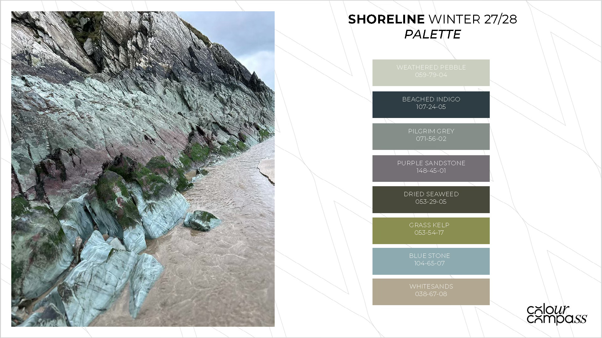
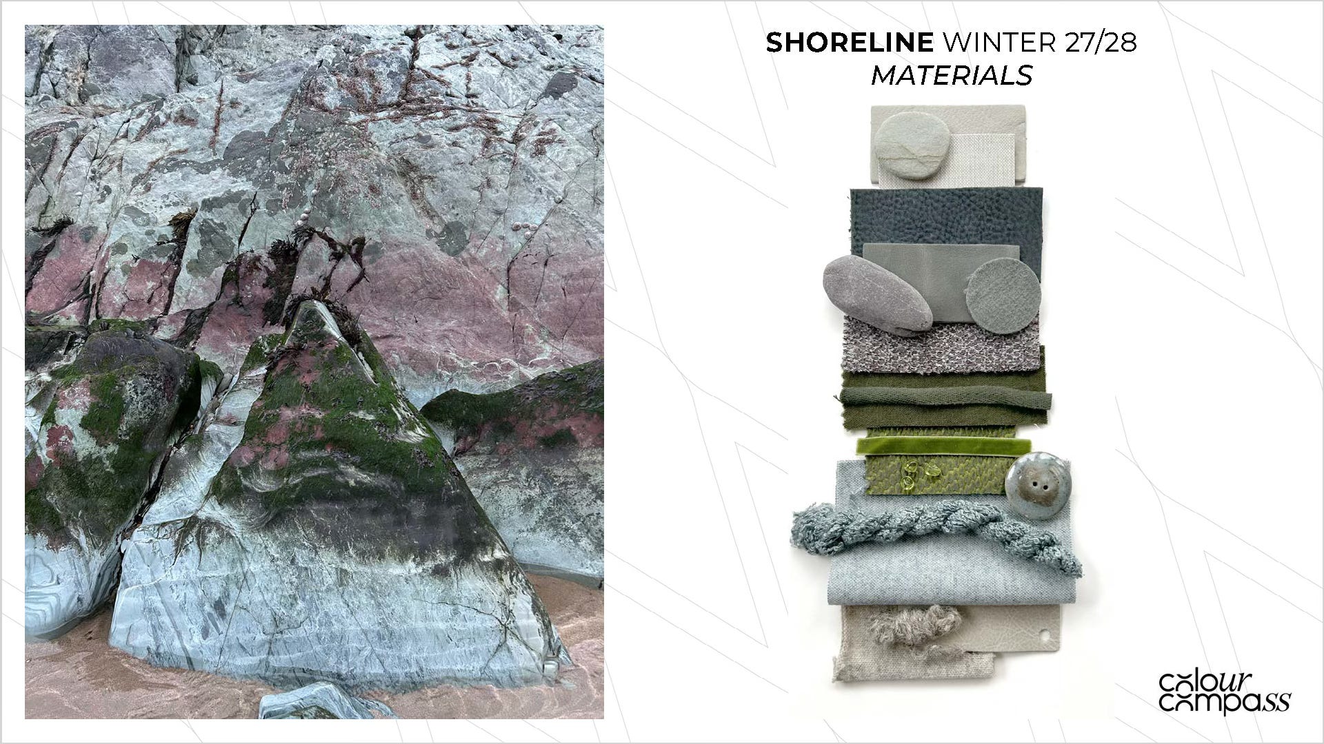
The erosion of the sandstone cliffs provides a rich source of colour and texture inspiration. The palette features cold winter tones—including sandy neutrals, tinted greys, and seaweed greens—which are amplified by the sea wash and the stone’s textured surface. These colours are designed to be showcased on brushed surfaces, marled knits, stone-washed wovens, and split leathers.
What’s driving this colour and material direction?
Travellers and home owners are seeking out quiet, peaceful destinations to power down and rest. A lovely example of this is the RIBA House of the Year 2025, ‘Caochan na Creige’, a remote dwelling built on the Isle of Harris, Scotland. It was designed to blend into the landscape and was clad in locally sourced Lewisian Gneiss stone. Retreats like this provide a space to observe, relax and blend into the natural landscape.
Tuning into the body’s natural rhythms and cycles is a growing wellness trend, enhanced by the use of health trackers. The demand for personalised health care and the expanding features of these wearables is allowing people to track hormone shifts, metabolism and sleep patterns. More of us are listening to our bodies and making considered choices about when we eat, sleep and exercise.
Being attuned to our environment and our bodies will drive us to seek out tactile surfaces that connect us to the present. Colours will have a subtle character which evokes nature and soothes the senses.
If you’d like to learn more about the Colour Compass 2028 colour and materials forecast, get in touch via our website at colourcompass.co.uk
Look out for the Spring 28 Colour Narrative which I will publish in the next couple of months.
Thank you for reading.